Open Your World
All IELTS Academic Writing Task 1 Types
1. A Line Graph
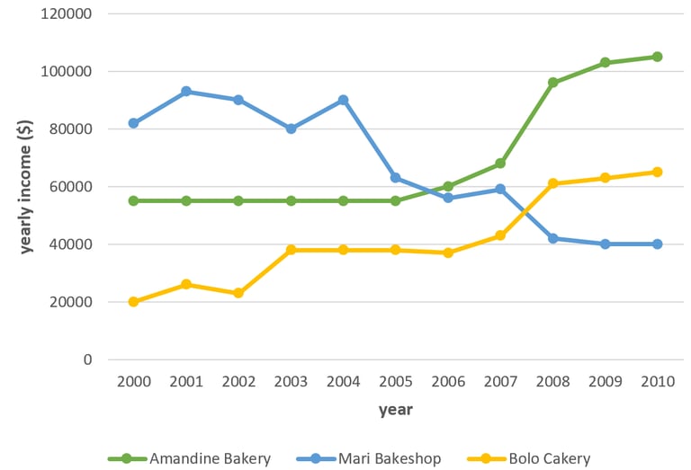
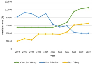
The graph shows data about the annual earnings of three bakeries in Calgary, 2000-2010.
Summarise the information by selecting and reporting the main features, and make comparisons where relevant.
Model answer
The graph shows information about the amount of money which was earned by three bakeries in Calgary, over a ten-year period between 2000 and 2010.
Overall, what stands out from the graph is that there were considerable upward trends in the income of both Bolo Cakery and Amandine Bakery, while the earnings of Mari Bakeshop saw a considerable fall over the period in question. Another interesting point is that Mari Bakeshop was the most popular bakery in 2000, but in 2010, Amandine Bakery earned more money than the others.
Looking at the details, as regards Bolo Cakery, income started at $20,000 in 2000, then there was a fluctuation over the next three years, at which point it levelled off at just under $40,000 until 2006. Then the figure went up significantly, finishing at around $65,000 in 2010. If we look at Amandine Bakery, the trend was similar. Having remained stable at approximately $55,000 in the first half of the decade, income then rose sharply, reaching nearly $100,000 in 2008. There was then a gradual rise to around $105,000 in 2010.
By contrast, the income of Mari Bakeshop went in the opposite direction. Takings fluctuated around $90,000 until 2004. After That despite falling sharply to just over $40,000 in 2008, the figure then levelled off in the last two years.
(219 words)
2. Describing a Bar Graph
The chart shows the average number of hours each day that Chinese, American, Turkish and Brazilian tourists spent doing leisure activities while on holiday in Greece in August 2019.
Model answer
The bar chart compares the amount of time each day that people from four different countries spent doing activities while on holiday in Greece in August 2019. The activities were going to the beach, visiting different attractions, and reading.
Overall, the tourists spent the most time reading books while they spent the least time visiting places. The Chinese tourists spent the longest reading books with a total of eight hours per day. By contrast, the Brazilians spent the longest at the beach with a total of six hours.
Both the American and the Turkish tourists spent the same number of hours every day visiting places with a total of three hours each. Similarly, the Turkish and Brazilian groups spent a total of four hours each reading books. The Chinese tourists spent twice the amount of time reading books as the Turkish and Brazilian tourists, whereas the American and Turkish groups spent three times the amount of time visiting places as the Chinese group.
(163 words)
3. Describing a Pie Chart
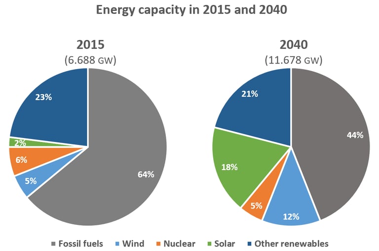
The pie charts below compare the proportion of energy capacity in gigawatts (GW) in 2015 with the predictions for 2040.
Summarise the information by selecting and reporting the main features, and make comparisons where relevant.
Model answer
The charts show the expected changes in energy capacity in 2040 compared to 2015.
The most noticeable feature is the drop in the proportion of the annual gross capacity of fossil fuels, with the projected capacity almost doubling from 6.688 to 11.678 gigawatts. It is expected to experience a significant decline, falling from 64% in 2015 to 44% in 2040. By contrast, it is predicted that there will be a dramatic rise in the proportion of energy capacity from solar energy with a jump from 2% to 18% in 2040. While the proportion of the capacity for wind is anticipated to increase more than twofold from 5% in 2015 to 12% in 2040, it is estimated that other renewables will account for a smaller proportion with a decrease from 23% to 21%. The projected proportion for nuclear energy will be 5% in 2040, a slight decline from 6%.
It is clear that despite the decline in the proportion of energy capacity from fossil fuels and the rise in solar and wind sources, the former will remain a major energy source in 2040.
(182 words)
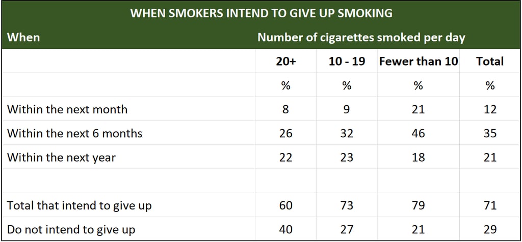
4. Describing a Table
The tables below show people's reasons for giving up smoking, and when they intend to give up.
Summarise the information by selecting and reporting the main features, and make comparisons where relevant.


Model answer
The two tables together give a snapshot of the reasons people choose to stop smoking and when they intend to give up.
The main reason smokers give for stopping is for general health (71%), with financial considerations (31%) and the risk of smoking-related diseases (25%) being the next two most popular reasons. One fact to highlight from this table is that almost twice the percentage of heavy smokers cite present health problems as the reason compared to light smokers.
According to the second table, the majority of smokers questioned (71%) intended to give up, with light smokers more inclined to stop (79%) than heavy smokers (60%). 35% of smokers said they were planning to give up within the next six months and only 12% said they were prepared to try within the following month. Although only 29% of smokers on average were unwilling to give up, heavy smokers were almost twice as unwilling to try as light smokers, which perhaps reflects the level of addiction in the former group.
(169 words)

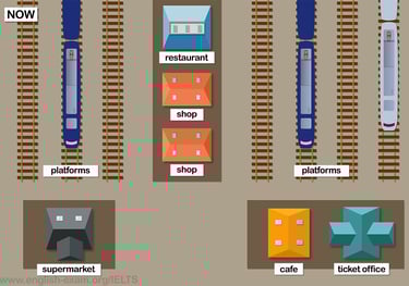
5. Describing a Map
The maps show Pacific Railway Station station in 1998 and now.
Summarise the information by selecting and reporting the main features, and make comparisons where relevant.
Model answer
The maps show Pacific Railway Station in 1998 and the present day. We can see that the station has been expanded, with significantly more facilities available to customers now compared with 1998. Firstly, the station has been developed and the number of platforms has increased.
In 1998, there were only four platforms but today there are seven. A restaurant has been added between the new and old platforms and the number of shops has grown, as there are now two shops situated next to the restaurant and the old shop has been removed. The ticket office remains in the same place but has been extended and is now much larger.
The Café has also stayed in roughly the same place, which is at the bottom of the old platforms. The toilets were previously in a separate building next to the platforms, but they have now disappeared. A new supermarket has been built at the bottom of the new platforms.
(159 words)


6. Describing a Diagram
The diagrams below give information about the manufacture of frozen fish pies.
Summarise the information by selecting and reporting the main features, and make comparisons where relevant.


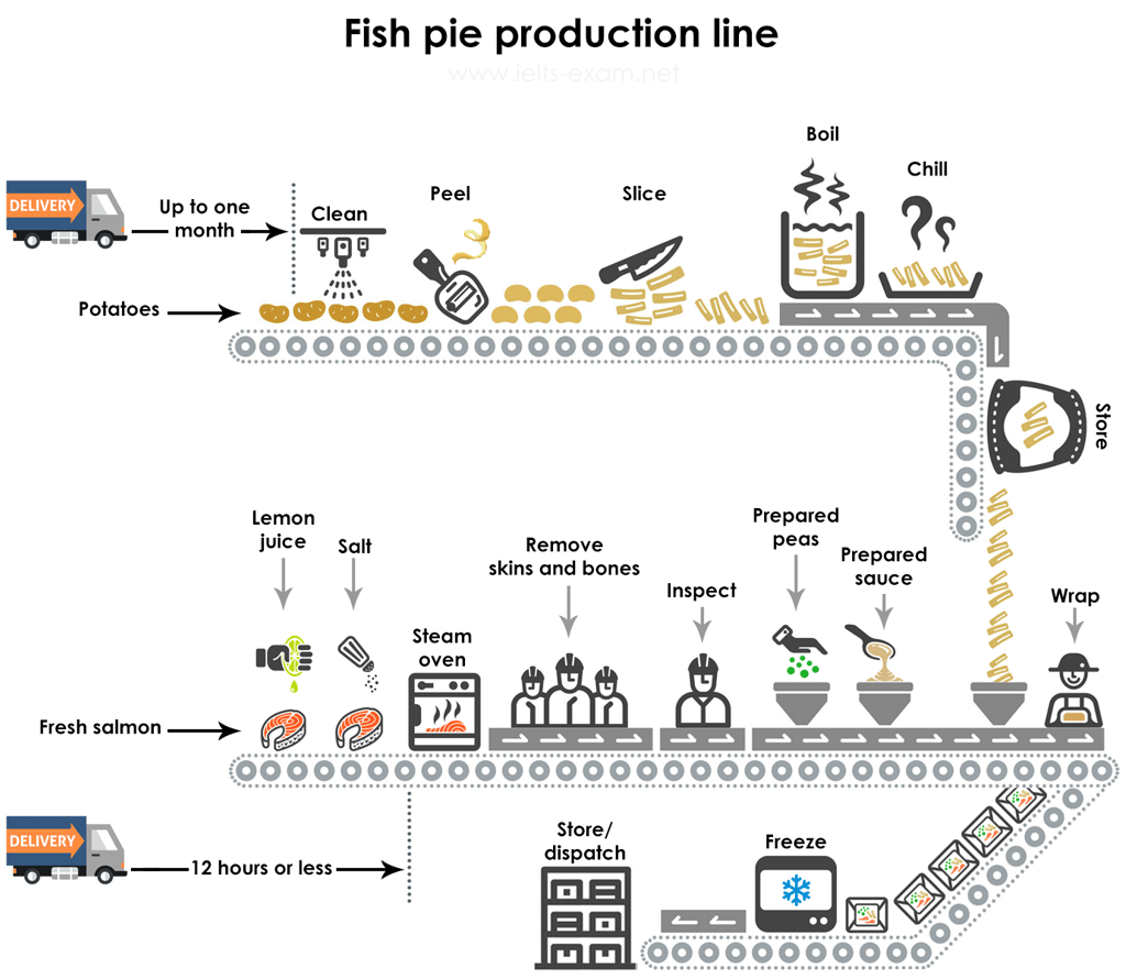

Model answer
This diagram shows that there are a number of processes involved in the commercial production of frozen fish pies. The main ingredients consist of fresh salmon, peas and sauce, with sliced potatoes, and they are prepared separately. The potatoes, which may have been delivered up to a month in advance, are cleaned, peeled and cut into slices. The slices are boiled and then chilled before being stored until needed. The preparation of the fish is more labor intensive than the preparation of the potatoes. Within twelve hours of being delivered to the factory, the fresh fish is cooked by being steamed with lemon juice and salt. Then the skin and bones are removed by hand and disposed of, before a visual inspection takes place.
After this, the pies are assembled in microwaveable containers Peas and sauce, which have also been prepared, are added to the fish and then the pie is covered with a layer of cooked potato slices. The pies are then wrapped and frozen. At this point they are ready for dispatch, or they may be stored at the factory before being dispatched.
(185 words)
7. Combination
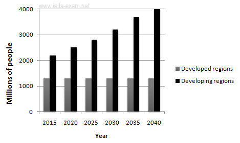
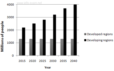
The graphs below provide information on global population figures and figures for urban populations in different world regions.
Summarize the information by selecting and reporting the main features, and make comparisons where relevant.
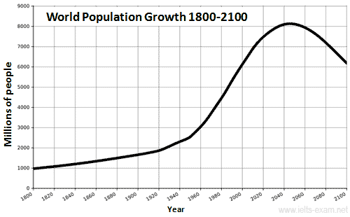
Model answer
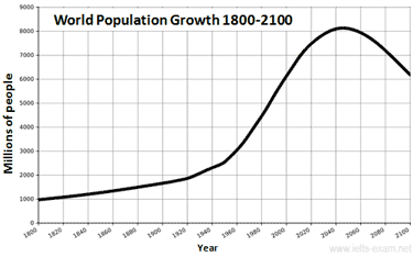
The first graph shows the trend in world population growth between 1800 and 2100, while the second graph gives predicted urban population figures for the next 25 years.
The world population has experienced continuous growth since 1800. Between 1800 and 1950, the population grew slowly from just under 1 billion to 2.5 billion people. After that, the growth rate increased and currently the figure is around 6.5 billion. Projections show a continued increase in population in the near future, but a steady decline in the population growth rate. The global population is expected to peak at 8.2 billion by 2050, and then decline to around 6.2 billion by 2100.
The predictions also show that almost all urban population growth in the next 25 years will occur in cities of developing countries. In developed regions, on the other hand, the urban population is expected to remain unchanged at about 1.3 billion people over the next two decades.
The graphs show that the global population increase will not occur evenly throughout the world, but will be greater in some areas than others.
(180 words)
Source: ielts-writing.info